
I had plans to share my rebranding journey because there was so much to do. Then suddenly it was like everything fell into place and I was left with this amazing site. It still needs a few tweaks here and there (meaning some posts/pages need to be updated) but for the most part is completely done. I could not be happier with how things look now.
I had plans to work slowly and then build it out from there. I came across this amazing logo and branding colors that I just loved from Kellie Lynn Media called Lemonade and there was just something about it. I wanted to add something to the blue that I was already using and yellow made the most sense. For some reason I had been thinking about lemons as a bit of inspiration. When I saw this branding I knew it was made for me. It had blue and yellow but also some mauve/purple that blended so well. I did add a softer yellow but I will tell you about that in a moment. I had planned to wait until I had the extra money for it then the stimulus came in and I thought well, why not. So, I set aside a small amount of it for my updates.
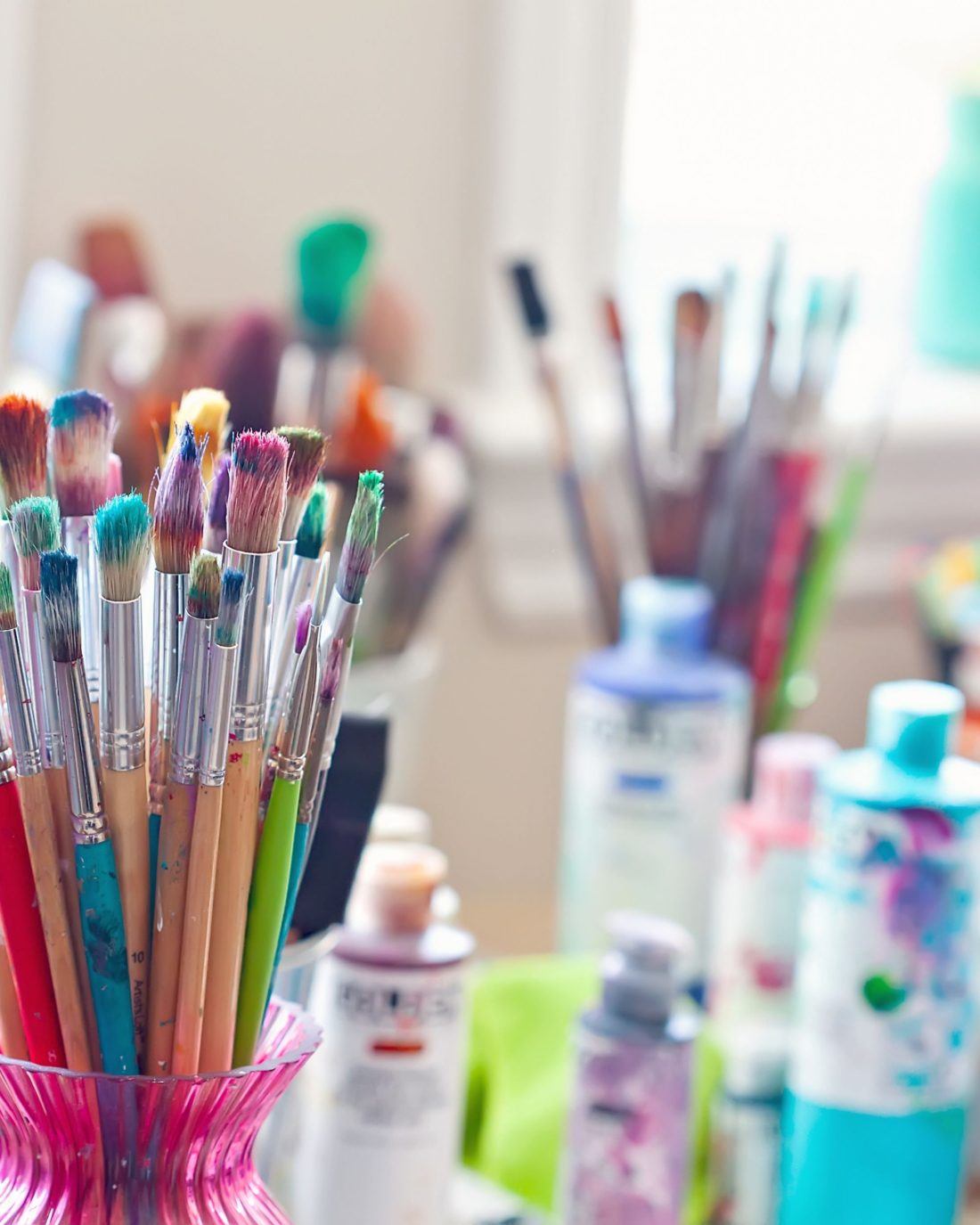
That is also when Restored 316 Designs sent me an email with their new Sage theme. It is a Kadence child theme and while it was more than I have ever paid for a premade them it has been a game changer. It is one theme that I can adjust, adapt, and change in almost every way. So that’s one them for all three blogs. No more learning coding or trying to figure out how to make something work. It came with four different home pages and to be honest I took the base of one of the home pages and adjusted it on each blog to fit my wants and needs.
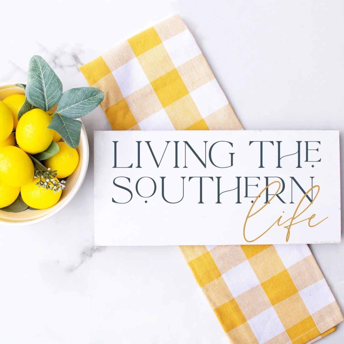
This theme came with amazing color palettes and it explained what each color is used for better than any other theme I have ever used including a custom one many years ago. It had eight colors and all I had to do was plug in the colors from my branding where I wanted to use them the most. When I put them in I realized I was short two colors and they were both background colors. So I selected a shade of yellow and a pale blue that worked well with everything else.
I hadn’t planned on putting anything out there for y’all to see until I began working on one of the other blogs and felt a little jealous that I wasn’t working on this one. If you go to any of the other blogs you will see updates but I’m holding off on doing a giveaway for them at the moment. I can tell you know that a huge giveaway for God, fitness, and Mental Illness will happen the first Saturday in June. I have it scheduled and ready to go. I am taking a break there until then and I will post a reminder on this blog when it happens.
Wickedly Romance will have a huge giveaway next month. I have been spacing them out a little bit and saving a little out of every paycheck (and stimulus) that I have gotten to afford these giveaways. They are huge let me tell you and it is because of y’all that I can do them. So without further ado lets get to this one.

Enter the Giveaway
ENTER BELOW FOR YOUR CHANCE TO WIN A $1000 PAYPAL CASH. GIVEAWAY IS OPEN WOLRDWIDE AND ENDS APRIL 30, 2021 AT 11:59 PM EST

I do like it looks great too.
I really don’t like to see all those blog giveaways. It will take you an hour to fill out one entry form. Then they want you to follow 50 or more of their social medias.
Love it. It looks great
Love the colors and it is well organized.
i don’t notice that much of a difference but it’s good
I really love the new look. I like the colors.
I am still getting used to the new looks too soon for me to tell yet. I like that the giveaways are over on the side again. I like it when they are easy to find and I hate pop ups and headers and footers so I don’t see any of that like on some blogs. It looks nice and clean.
I like the new layout and colors!!
Change is always good! I love it, but even if I didn’t…who cares? I love your blogs and I subscribe to all of them. Thank you for all of your hard work. I’m a blogger on a friend’s blog so I look up to you and read your posts for inspiration!
I love the color choices! The addition of yellow is a nice touch. I love the new look!
I did not enter my tweet link correctly in rafflecopter, so here it is: https://twitter.com/yarbr012/status/1379557539273179136
It’s great! Love it.
Love it. Your blog is one of my favourites. 🙂
Like the design!
Nice colors and good fonts.
It is nice loving the colors
I like it! It’s clean and fresh!
I like it. 🙂
I love it, the colors are calming and very springlike
I do like the new look. The yellow you chose is such a fresh, pretty color. Even with help from premade themes & color pallets to choose from that is a lot of work, especially for 3 blogs. It must be very satisfying to have a vision in mind and see it come to fruition. Thank you you so much for the giveaways and all of the work you put into content on all 3 blogs for your readers.
I enjoyed the new look. The colors are vibrant!
I love the new theme! The colors are nice and your site is easy to navigate.
It looks great.
I like it.
Very clean and professional looking! I like it!
Love how bright it is. Easier to navigate.
I like the new colors. They’re very pleasing to the eyes.
I really like it – nice colors and super easy to navigate
I love the new site. It’s warm and easy to navigate! I love the the rebranding of the name of the blog too! Great job.
I love the new look – easy on the eyes and to find what I am looking for.
Good job!
Love it. It looks great.
It look classy and fresh!
I think it looks clean and easy to read.
Thanks for the contest.
I like the new look. Especially the fonts.
I love the new look! Love the bright colors!
Nice and tidy 🙂
I really like the thin font, especially in the headings. It’s very elegant.
I love the new look. I think it looks great!
I like the new look!
I really love it. I love the pop of yellow, and the overall minimal vibe! Awesome job!
Love the simplicity of the layout.
I love it, it looks so clean and refreshing, wonderful job
I can’t see what it says in yellow under ‘Rita Reviews’. Hard to tell but nice, simple layout too!
I think you did a nice job. I love the colors!
I’m really loving the new design! The site looks great!
I love it! It’s classy, easy to navigate and I love the color palette!
Love it! It looks so classy!
Im loving the softness of the new look! 🙂
I love the new look. It’s bright and cheery.
Personally, I think that it looks great!
I like it. It’s easy on the eyes and easy to navigate.
I’m loving it ! As for layout etc there is no difference but could just be the way my Kindle sees it.
I like the new look. I have followed you for 10 + years and appreciate how quick it is to load. I like how there are few things slowing the page down which makes it more pleasant to visit.
I love the new look and the blog! I hope you are well! Thanks for the opportunity!